
How to Choose the Best Fonts for Your Book Cover (With Genre Examples)
Dec 01, 2025 • 6 minutes • by TiffanyHave you ever watched a movie where a scene unfolds and you’re not quite sure how to feel? Maybe you’re torn between thinking it’s tragic or comically ironic, until the music starts playing. Suddenly, the tone snaps into place, and you understand exactly what the director intended. Fonts play a similar role in book design. They’re the “music” of your cover, subtly guiding the reader’s emotional response and setting the mood before a single word of the story is read.
You’ve might have seen this before, but it’s a perfect example of how the right font choice can influence the mood:

Now let’s get into a few more things to look out for when you’re searching for the perfect font (or fonts) for your cover.
Does the font fit genre expectations?
Now that you have a better understanding of a font’s mood, now you can start to think about genre expectations. A gritty thriller with a curly script font feels … wrong. A gentle romance with a blocky, industrial typeface also sends mixed signals. Readers rely on these visual “shortcuts” to instantly recognize the kind of story they’re getting.
Choosing a font that matches the emotional vibe of your genre helps your cover feel instantly familiar, while still giving you room to make it uniquely yours. You don’t have to follow every genre rule, but you do need to know them before you break them. Breaking a genre rule should feel like an intentional choice, not a mistake. To help you make those intentional choices, let’s go over some ground rules.
Is the Font Legible? Or Clashing With the Other Elements?
A beautiful font isn’t helpful if no one can actually read it, especially at thumbnail size, where most online shoppers first encounter your book. Consider how your font interacts with your background art. Does it stand out? Does it fight with busy textures? Are the colors high enough in contrast to be readable? Good typography shouldn’t have to wrestle for attention, it should sit comfortably on the canvas. A simple exercise is blurring or squinting your eyes when looking at the cover: if you can still make the overall shape of the title, then you know you’ve checked all the right boxes. Sometimes an outline or a light drop shadow is all you need to lift the text from the background.
Is It Overused?
Some trendy typefaces rise in popularity and quickly become cliché (I’m looking at you, Papyrus and Comic Sans). When readers start recognizing the font more than the book, it’s time to move on. Try browsing bestseller lists to see what’s currently dominating your genre, and aim for something that feels fresh but still appropriate.
Does the License Allow You to Use It on a Book Cover?
This part isn’t glamorous, but it matters. Not all fonts are free to use commercially, and even paid fonts may have restrictions depending on how they’re distributed. Book covers, merchandise, and advertising sometimes require additional license tiers. Always check the license before downloading or purchasing a font. If you’re unsure, look for clear labels like “free for commercial use,” “desktop license,” or “web-only” so you don’t run into surprises later.
Google Fonts is a safe bet, since all the fonts are free and can be used commercially.
Four Tips on Pairing Fonts
Pairing fonts effectively is all about creating balance and clarity in your cover design. Your title, subtitle, and author name should each have a distinct place in the visual hierarchy, and the fonts you choose need to support that structure without clashing with one another. A few simple tips:
1. Use contrast
You can create contrast by mixing categories—like pairing a serif (a small decorative stroke or extension at the ends of a letter’s main lines, like in the typefaces Times New Roman and Garamond) title with a clean sans-serif (a font without the small decorative strokes, like Helvetica and Arial) subtitle, or the other way around. You can also introduce contrast through weight (bold vs. regular) or width (a condensed title paired with a wider subtitle or author name). Whatever approach you take, the key is to make sure the fonts feel complementary and the choices look intentional, not accidental.
2. Limit yourself
Stick to two fonts max unless you have a very good reason to add more, such as taglines, forewords, or award mentions.
3. Establish hierarchy
Decide what should catch the eye first (usually the title), then choose fonts that support that order, like a larger, heavier, and fancier font for the title, and a smaller, simpler typeface for the subtitle and author name.
4. Avoid pairing two dramatic fonts
If both fonts have “big personalities,” they’ll compete instead of complementing. To keep your cover clean and readable, choose one decorative or expressive font and pair it with something simpler that helps balance the design.
Fonts to Choose From, Filtered by Genre
Here’s a selection of fonts that you can use on your book cover, organized by genre. All of these options are available on Google Fonts, so you can rest assured that they can be used commercially.
Fantasy
Fantasy covers often use ornate serifs, calligraphic styles, or medieval-inspired typefaces because they instantly evoke magic, mythology, and epic world-building.

Nonfiction
Nonfiction usually sticks to clean, readable serifs or sans-serifs that communicate credibility and professionalism. These fonts prioritize clarity and trust, helping the reader feel confident that the book is authoritative, thoughtfully presented, and easy to navigate.

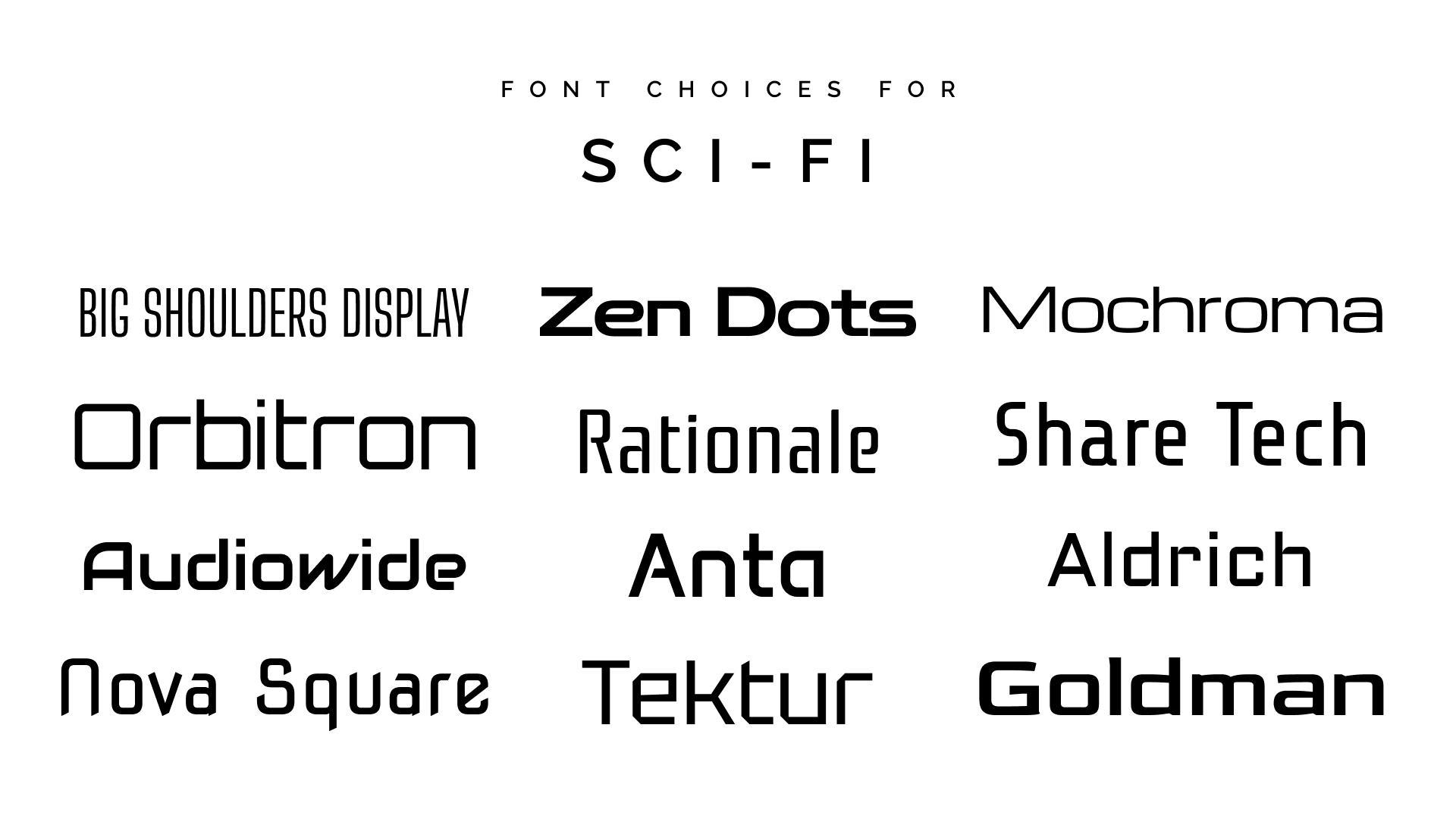
Sci-Fi
Sci-fi leans toward clean, geometric sans-serifs or futuristic display fonts. These styles communicate technology, innovation, and sleek, imagined futures.
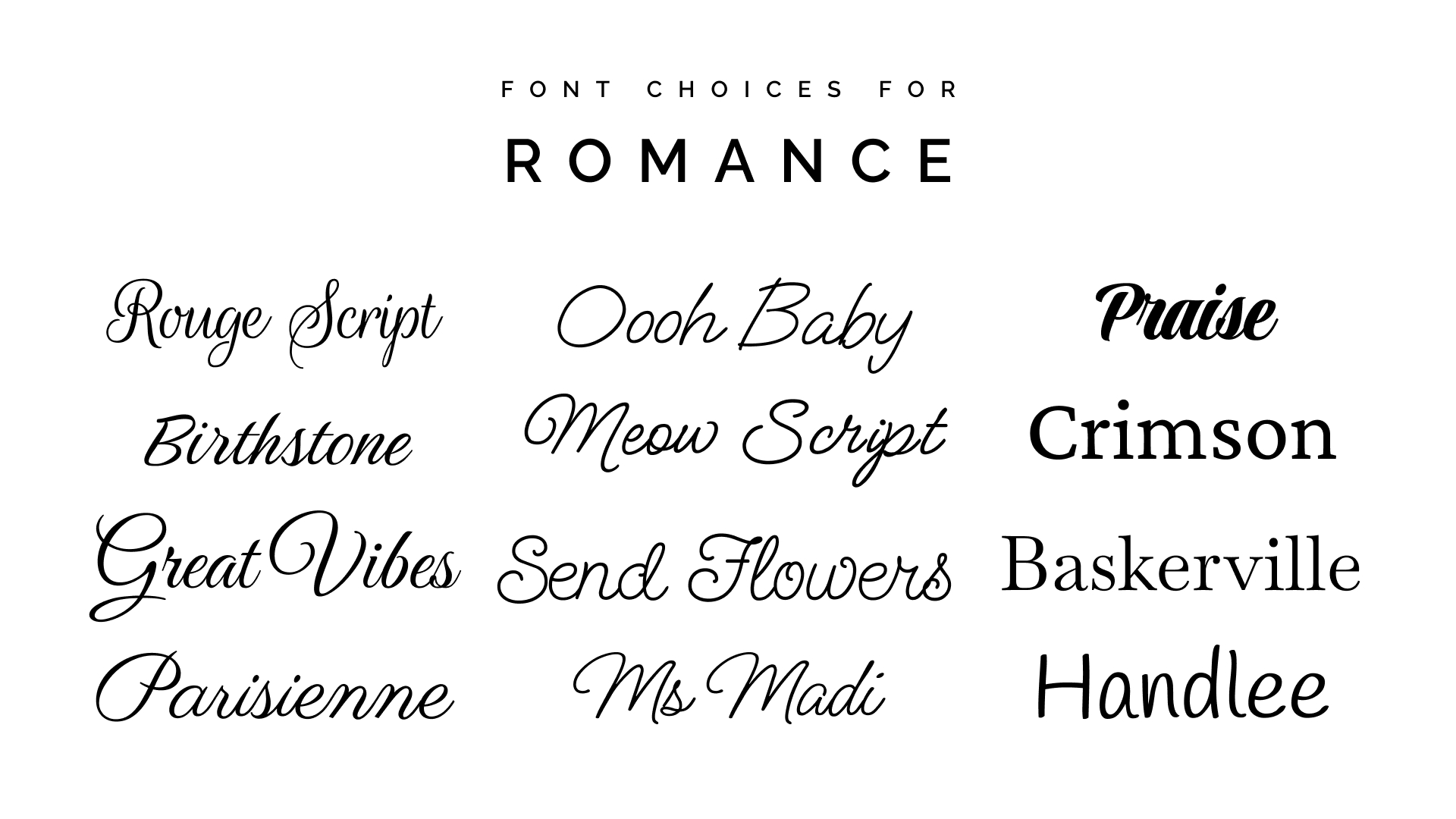
Romance
Romance tends to favor soft, elegant fonts (often scripts or refined serifs). They convey emotion, warmth, and intimacy.
Western
Western typography often pulls from slab serifs, weathered textures, or vintage-inspired lettering to reflect rugged landscapes and Old West themes.

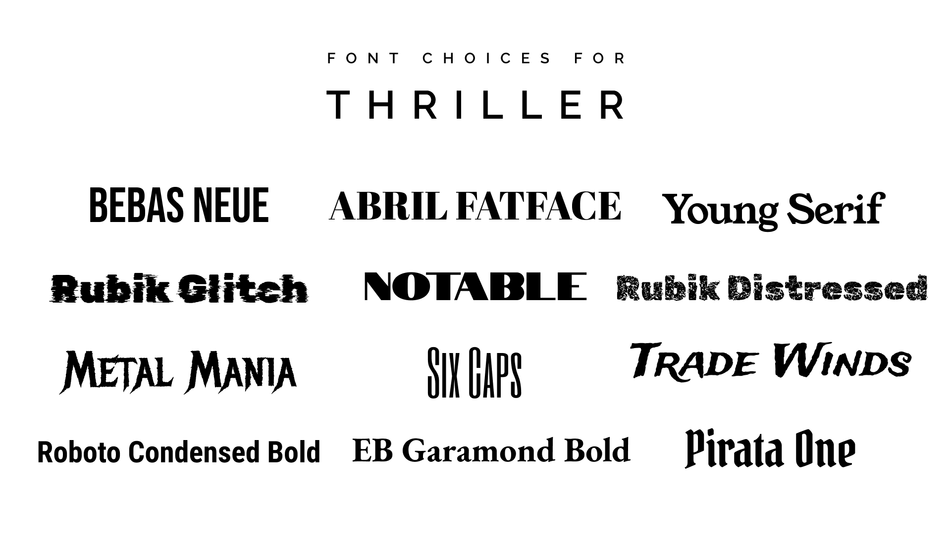
Thriller
Thriller covers typically rely on bold, high-contrast sans-serifs or condensed fonts that create tension and urgency. Sharp lines, strong structure, and dramatic spacing help convey danger, mystery, and fast-paced action.
Choosing the right fonts for your book cover might seem like a small detail, but it has a huge impact on how readers perceive your story. From signaling genre to improving readability, thoughtful typography helps your book make a strong first impression. As you experiment with font styles, pairings, and hierarchy, remember that the goal is always the same: to communicate your book’s mood clearly and more confidently.
Still fighting with your fonts? If designing your book cover is making you feel stuck, or even if you just want a second pair of eyes, check out our book cover design services. We’re always happy to help authors get their cover just right!